Earnest VS Deceptive Visualizations
Which visualization is trying to deceive you?
| Option 1 | Option 2 |
|---|---|
 |
 |
Click for Answer!
Option 1 is the earnest or honest visualization and Option 2 is trying to deceive you!
Earnest Visualization Analysis

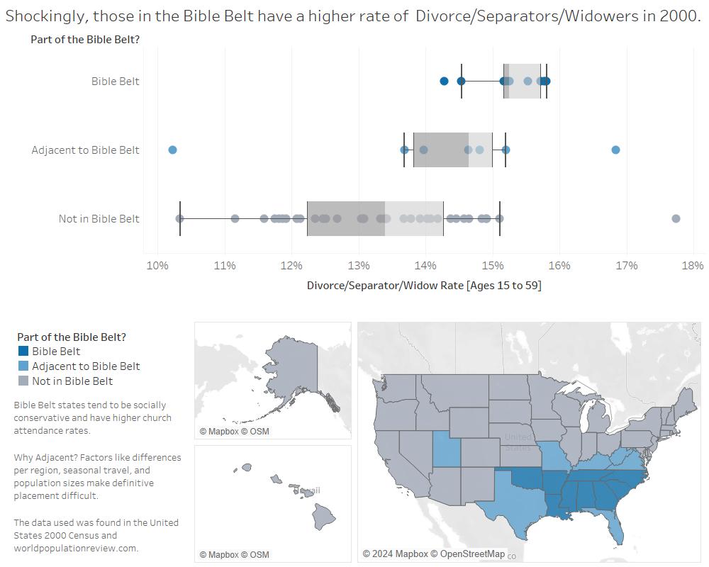
In my earnest visualization, “Shockingly, those in the Bible Belt have a higher rate of Divorce/Separators/Widowers in 2000,” I answer the question: How do the Bible Belt’s rate of Divorce/Separators/Widowers compare to other states? The Bible Belt is associated with more conservative states and being more religious. For these reasons I assumed the Divorce/Separators/Widowers rate would be lower than the other states. However, to my surprise I found that the Bible Belt has a greater Divorce/Separators/Widowers rate. Something important to note is the “Adjacent to Bible Belt” group. These are states that are sometimes considered to be part of the Bible Belt. Factors like the differences per region, seasonal travel, and population sizes can make it difficult to definitively say these states belong to the Bible Belt. For example, Florida is highly debated because the state has a large population of non-religious snowbirds and has cultural differences between Northern and Southern Florida. It is hard to confidently say Florida is wholly part of the Bible Belt. For this reason I had these “sometimes” states in the Bible Belt as their own group. I imagined they would be in the middle of states outside of the Bible Belt and the Bible Belt (and I was right!). My dataset comprised of four different sources: “Ratio of Unmarried Men per 100 Unmarried Women for the Population 15 Years and Over for the United States, States, and Puerto Rico: 2000,” “Marital Status for the Population 15 Years and Over for the United States, Regions, States, Puerto Rico, and Metropolitan Areas: 2000,” “Bible Belt States 2024,” and “Most Religious States 2024.” The first two are from the U.S. Census Bureau and the other two are from World Population Review. When putting all of these datasets into a single, large csv file I was able to better explore the relationship between divorce and religion and the relationship between religion and state.
In my honest visualization I incorporated multiple features to better answer my question. I chose Tableau’s web-safe and color-blind friendly color palette, which has gray and blues. I assigned the two different blues to the Bible Belt and the gray to the other states. I did this because I wanted people to see there was a relationship between “Adjacent to Bible Belt’’ and “Bible Belt.” Since the two blues are similar the viewer might think there is some similarity between those states, which is what I wanted. Something else I did was add a map of the United States with the same colors used in the box-whisker plot to show which states were part of which group. I decided to utilize a box-whisker plot because it provided a quick summary of the variability of values inside of my dataset. We can see the outliers, the median, minimum and maximum values, and the upper and lower quartiles. I decided the median was a more robust measurement compared to the mean because we had some outliers in the data. The rate of Divorce/Separators/Widowers was calculated by doing the percentage of Divorce/Separators/Widowers for ages 15 to 59 and then multiplying those values by the number of people within those groups to find the number of divorcees, separators, and widowers. After that, I took that number and divided it by the number of people within that state above 15 years old. The reason I chose the ages 15-59 was because 60+ year olds are more likely to pass away and become widowers/widows and I did not have data on anyone below 15 years old. I made my title my honest reaction in the hopes others would find this discovery interesting. I chose my x-axis to be the proportion and the y-axis to be the Bible Belt Groups for clarity. Tableau does not like having the axis title below distinct values on the x-axis. With a vertical box-whisker plot it became confusing. I wanted everything to be as clear as possible, which is why my labels are explicit about the rate and the different groups have unique names. Finally, I have a caption to define the Bible Belt and the “Adjacent to Bible Belt” group. I also use the caption to cite my data because I used a different dataset than those provided to us.
Deceptive Visualization Analysis

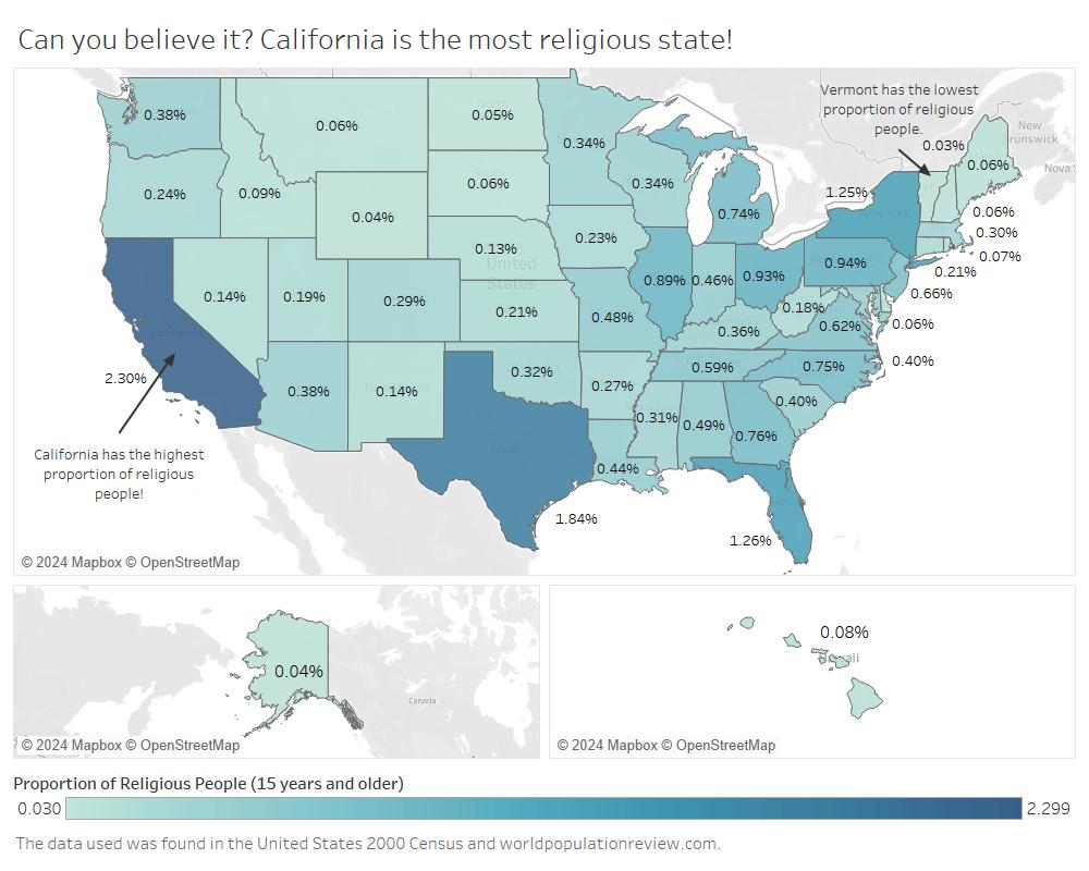
In my misleading visualization, “Can you believe it? California is the most religious state!” I answer the question: What state has the highest proportion of religious people? I chose this to be my misleading visualization because I thought one could find this sort of diagram on the news or in articles. My mother was talking to me about how California had really high COVID numbers at the height of the pandemic and it was because there were a lot of people in California. The ratio of people being infected was not necessarily larger than other states. Simply, there were more people in California and so it looked like lots of people were getting sick. This inspired me to use this common confusion of large populations in my own chart. I used the same dataset as my earnest visualization to explore the “relationship” with religion and state. I had a goal to make California, which has a really large population, appear to be something it was not: the most religious state.
In my deceptive visualization I am tricking viewers with the transformation done with the data. I had the number of people within each state, the religious percentage per state, and the total population of the United States inside of my dataset, which I used to make my transformation. To say how religious a state is I would simply use the religious percentage per state, but instead I multiplied the religious percentage by state with the number of people within each state then divided that by the total population of the United States. This proportion tells the viewer the number of religious people in a state over the whole United States (above 15 years old), which is different from how religious a state is. I try to sell this by then pointing out with annotations how California has the highest proportion and Vermont has the lowest proportion. By using ambiguous wording I can sort of sway any initial reaction that would go against “California is the most religious state!” I was also trying to get the viewer to see if there was a relation with the size of a state and/or if the location (West or East coast) might have any factor in how religious a state was with the annotations. Furthermore, I chose my title to be pointed in the hopes it would imply something before the viewer inspects my map more closely. All this thinking would distract them from my trickery! I created a choropleth map of the United States because it would help the viewer see the differences on a state level. I used the proportion as the color and the label to help people easily visualize the differences between the states. Something misleading I kept in was the gradient used for the colors. The color I chose was blue-green and when I tested it with a color blindness simulator it held up well. We talked about in lecture that gradients make it hard for people to distinguish some of the smaller differences and instead, to be more clear, we should use steps to increment the colors. I didn’t use the steps because I was trying to be deceptive.
Bibliography:
U.S. Census Bureau. “Marital Status for the Population 15 Years and Over for the United States, Regions, States, Puerto Rico, and Metropolitan Areas: 2000.” Ratio of Unmarried Men per 100 Unmarried Women for the Population 15 Years and Over for the United States, States, and Puerto Rico: 2000, 20 Oct. 2003, www2.census.gov/programs-surveys/decennial/2000/phc/phc-t-27/tab03.pdf.
U.S. Census Bureau. “Marital Status for the Population 15 Years and Over for the United States, Regions, States, Puerto Rico, and Metropolitan Areas: 2000.” Marital Status for the Population 15 Years and Over by Age for the United States, Regions, States, and Puerto Rico: 2000, Census Bureau, Census 2000 Summary File 3, 20 Oct. 2003, www2.census.gov/programs-surveys/decennial/2000/phc/phc-t-27/tab01.pdf.
World Population Review. “Bible Belt States 2024.” World Population Review, 2024, worldpopulationreview.com/state-rankings/bible-belt-states.
World Population Review. “Most Religious States 2024.” World Population Review, 2024, worldpopulationreview.com/state-rankings/most-religious-states.